Porsche vs BMW - Comparing Brand Guidance Systems
- Published: 02/03/2026
- 9 minutes read

Porsche vs BMW - Comparing Brand Guidance Systems
- Published: 02/03/2026
- 9 minutes read
Introduction
The automotive industry uses brand and design guidelines to establish company identity systems that maintain brand consistency while translating engineering concepts into visual and experiential elements. The official brand materials of Porsche and BMW present two distinct models of brand governance. The two manufacturers compete within the same performance-luxury market, yet their brand documentation establishes separate methods for managing their brand identity and architectural design. The Porsche describes branding as a holistic experiential system shaped by archetypes and principles. The BMW, on the other hand, describes branding as a structured communication system built around a claim and visual standards.
The following fourteen sections explain these systems and their differences.
Brand Philosophy
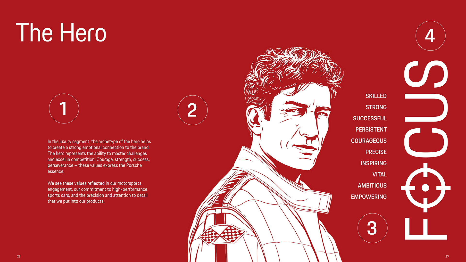
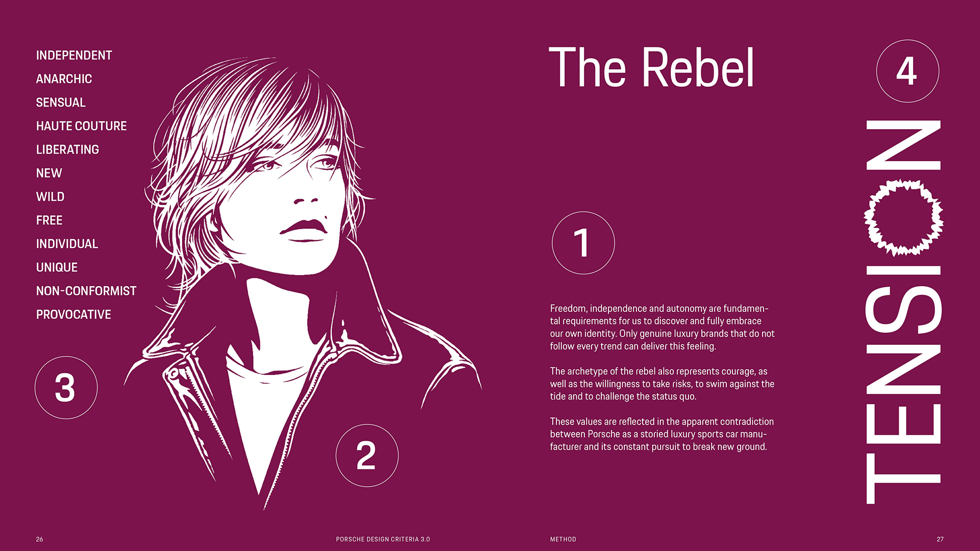
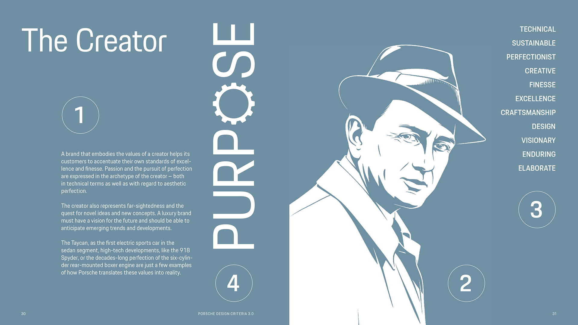
The Porsche defines the brand through identity constructs that guide all design and experience. Porsche is shaped by three archetypes: Hero, Rebel, and Creator. These archetypes define the brand character and guide how it should be expressed visually and experientially. The Hero represents performance and mastery. The Rebel represents courage and independence. The Creator represents innovation and visionary engineering.
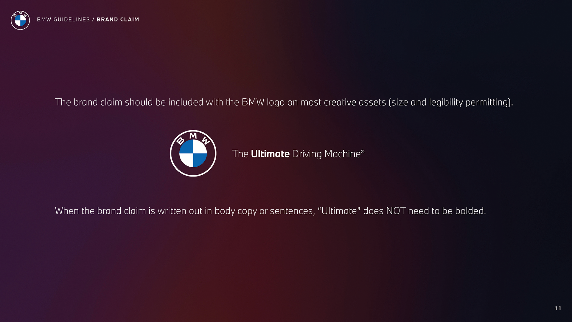
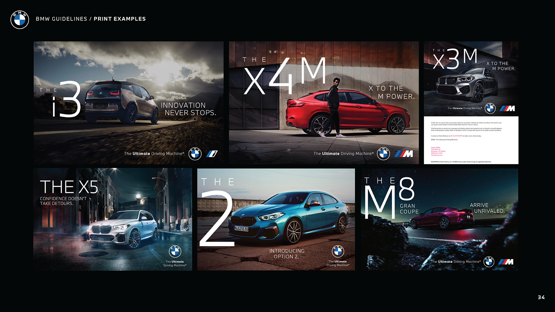
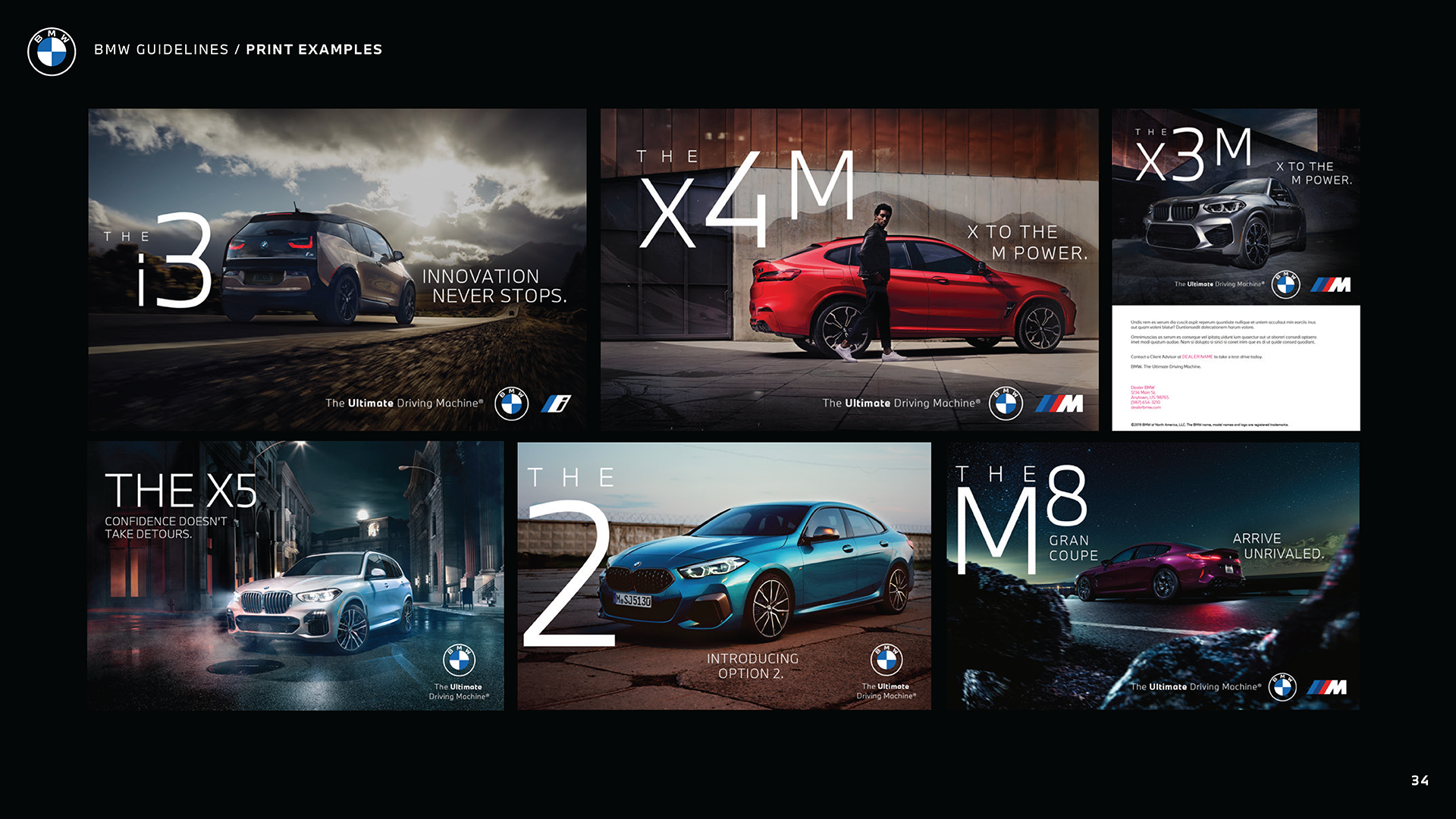
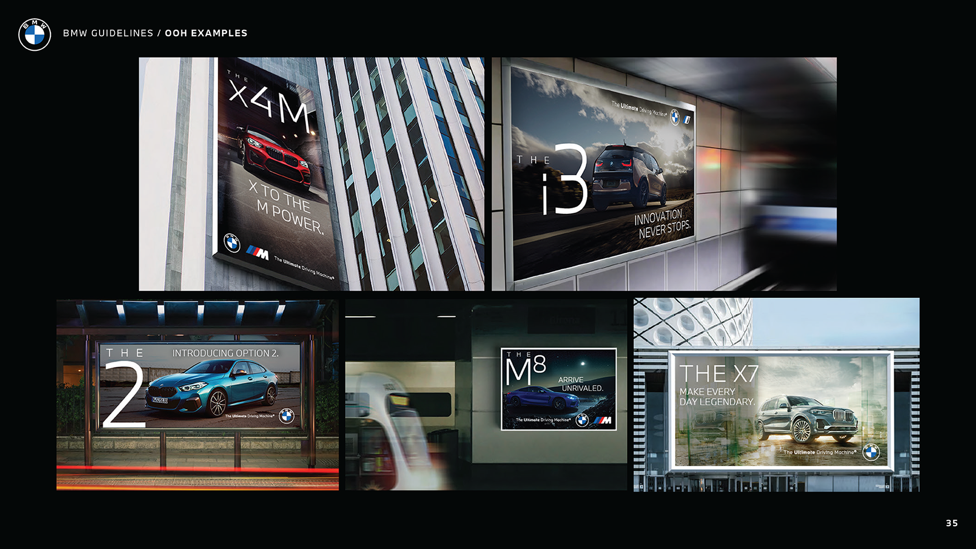
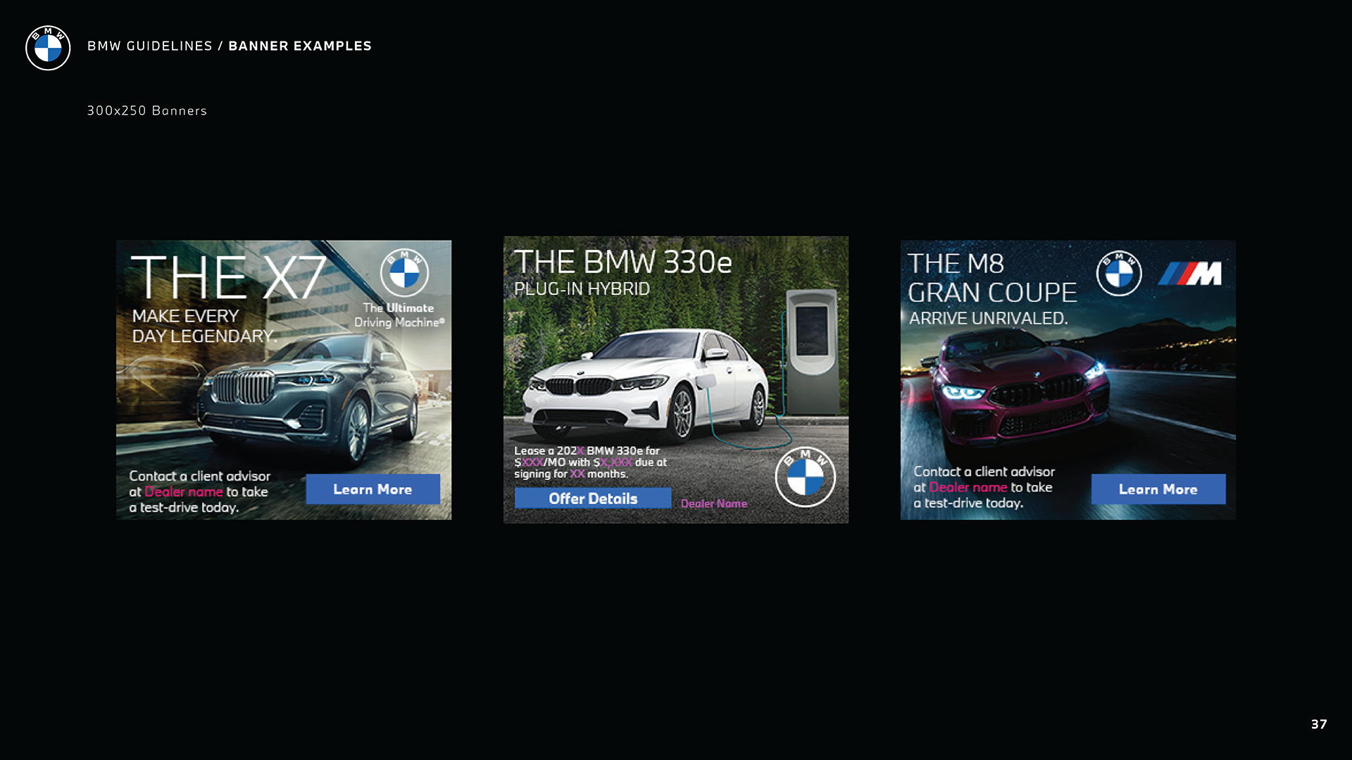
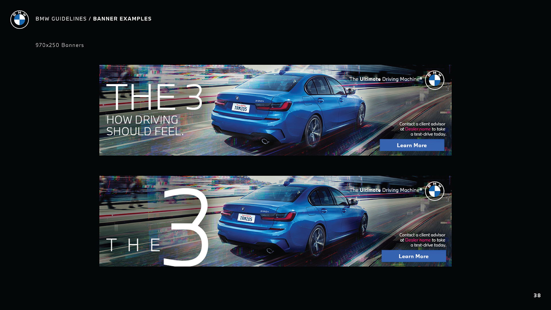
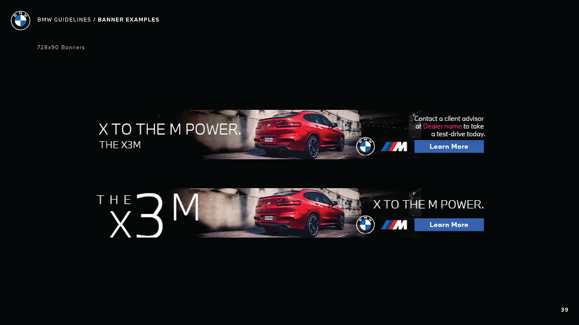
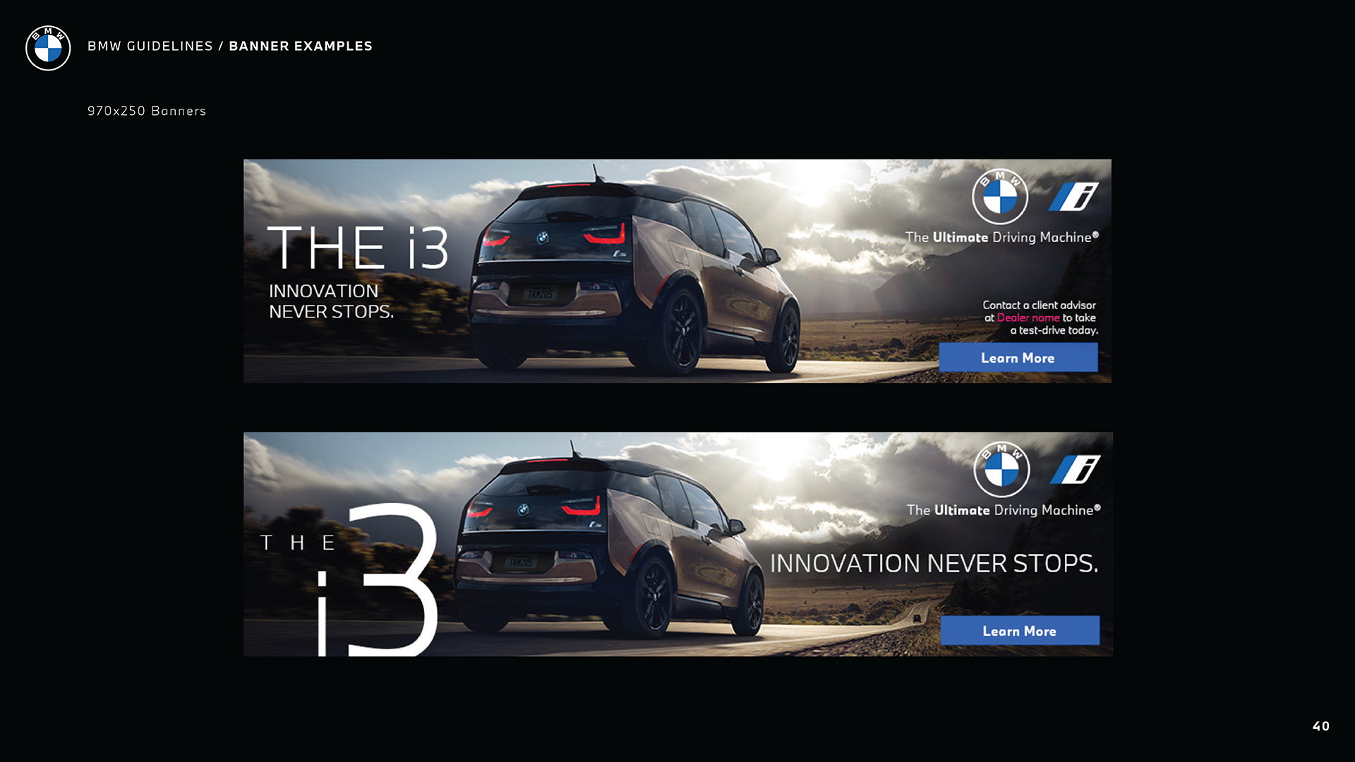
Three brand principles are supporting these archetypes: Focus, Tension, and Purpose. Focus is based on concentration on essentials and avoidance of unnecessary elements. The dynamic forces of tension create the essential design elements that Porsche uses to develop both its vehicles and their performance characteristics. Purpose ensures that every element has meaning and function. Together, these constructs guide products, communication, digital interfaces, and environments. The BMW guideline establishes the brand foundation in a different way. It presents the brand claim “The Ultimate Driving Machine” as a central identifier that should accompany the BMW logo on most creative assets.
The claim is treated as a core element of brand expression and is integrated with the logo in defined mockups.
Thus, Porsche defines brand philosophy through archetypes and principles, while BMW defines it through a claim and logo signature.
Brand Core Definition
For Porsche, the archetypes and principles together form the core brand identity. They define how Porsche should be perceived across all touchpoints. The brand is characterized as performance-driven, purposeful, and visionary. Identity is therefore multidimensional and experiential. For BMW, the brand core is expressed through the consistent use of the claim and logo combination. The claim communicates the brand’s promise, while the logo provides recognition. Lockups define how these elements appear together. The core identity is therefore concentrated in a single verbal-visual construct.
Porsche’s core is an identity framework. BMW’s core is a positioning statement with a visual signature.
Brand Expression Philosophy
Porsche is living proof that the design must express performance and function. Form is determined by purpose. Aesthetic elements communicate power, precision, and dynamic tension. Design is reduced to essentials, avoiding unnecessary decoration. Every element contributes to meaning and to the expression of performance.
BMW defines expression through the correct use of visual elements. It specifies which logo to use in different contexts, how the logo interacts with backgrounds or images, and how it combines with the claim. Expression is therefore achieved by applying standardized graphic rules.
Porsche uses purposeful design to create its signature style, which it calls its brand. The visual design of BMW products serves as the primary means of expressing their brand identity.
Brand World vs Asset System
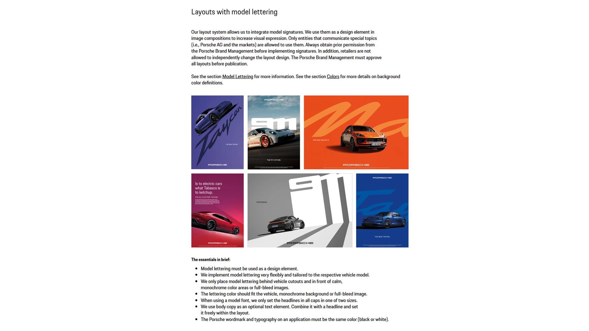
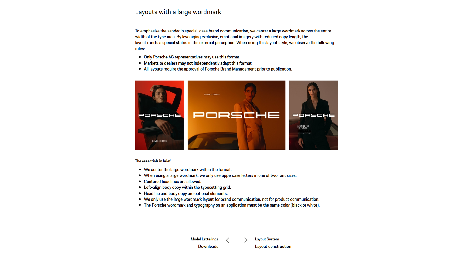
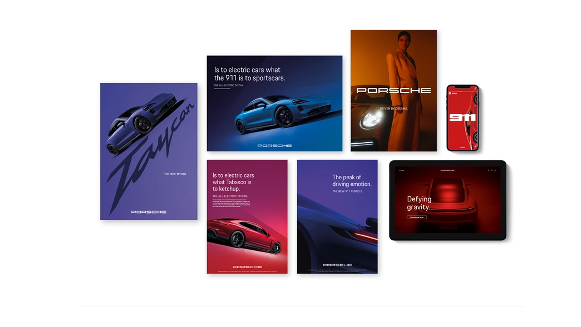
Porsche is a holistic performance brand experience. It defines itself as a complete world in which product design, communication, digital interfaces, spatial environments, and interaction all work together as one coherent expression. Every touchpoint must feel unmistakably Porsche, not only visually but also in behavior, precision, and quality of interaction. The brand is not limited to graphic elements; it lives in how things move, respond, and perform.
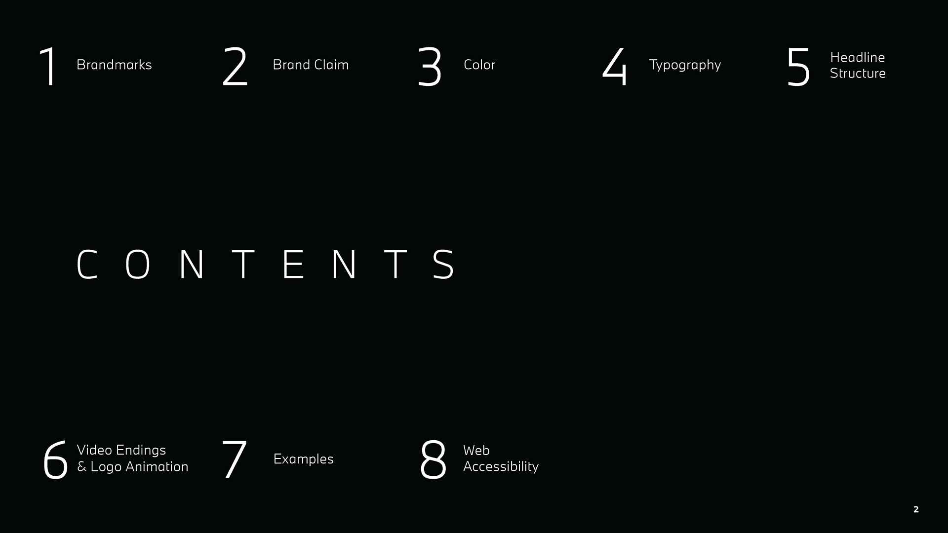
BMW is a structured brand system built from coordinated assets. Its branding is organized into clearly defined categories, including brandmarks, colors, typography, headline structure, video endings, templates, and accessibility standards. The rules for executing each component establish specific requirements that must be followed throughout all applications. The brand exists through precise management of all aspects of communication.
Porsche uses brand experience as their main branding approach, while BMW treats brand identity as a system that requires systematic management.
Logo Philosophy
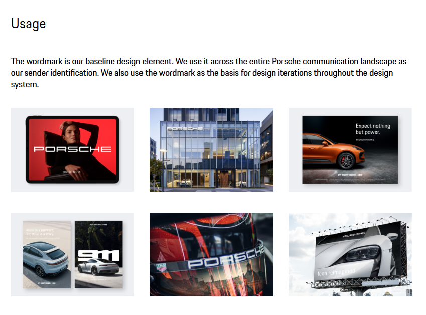
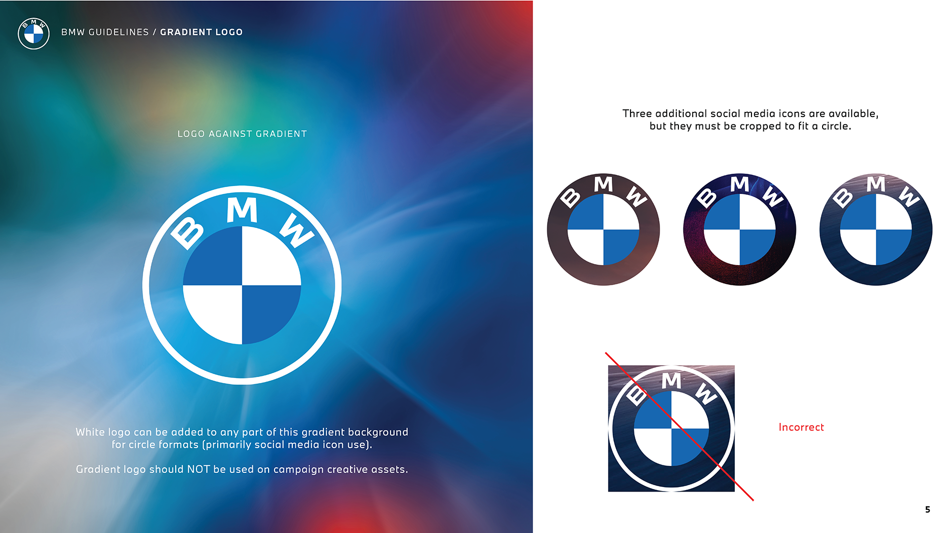
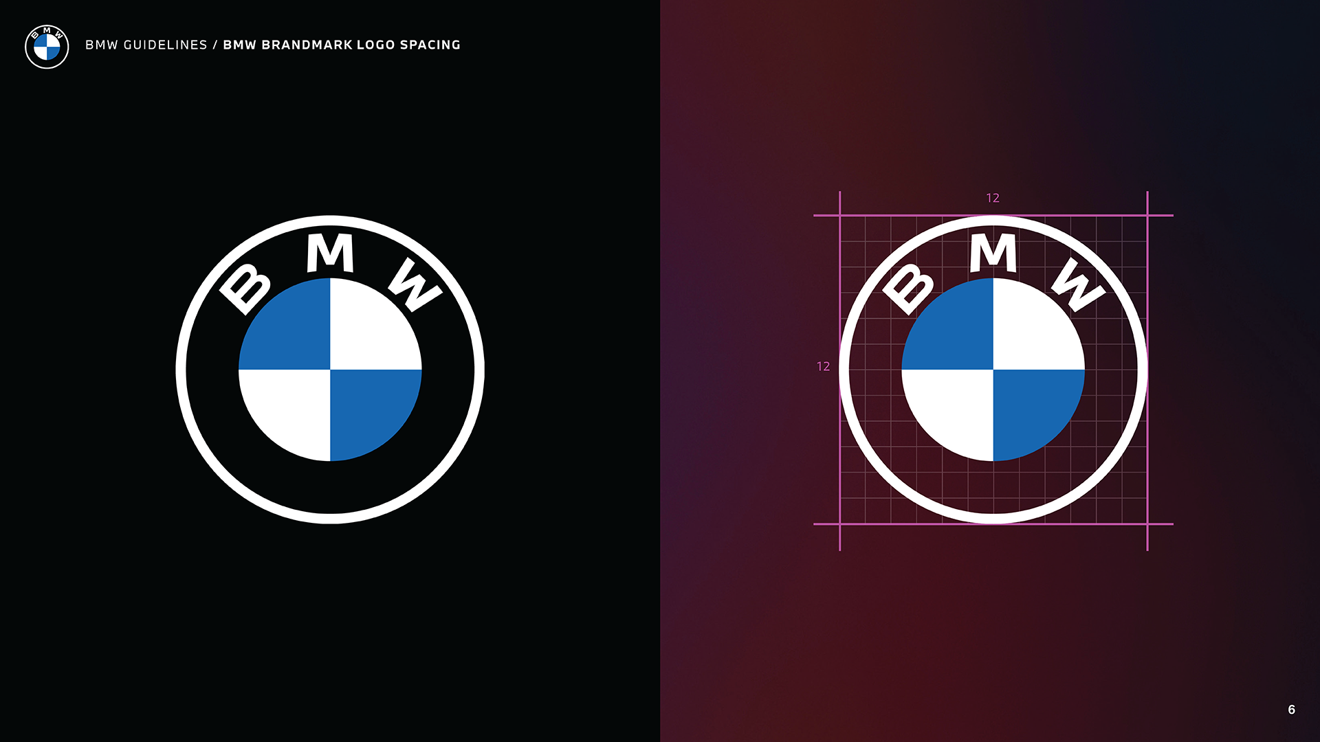
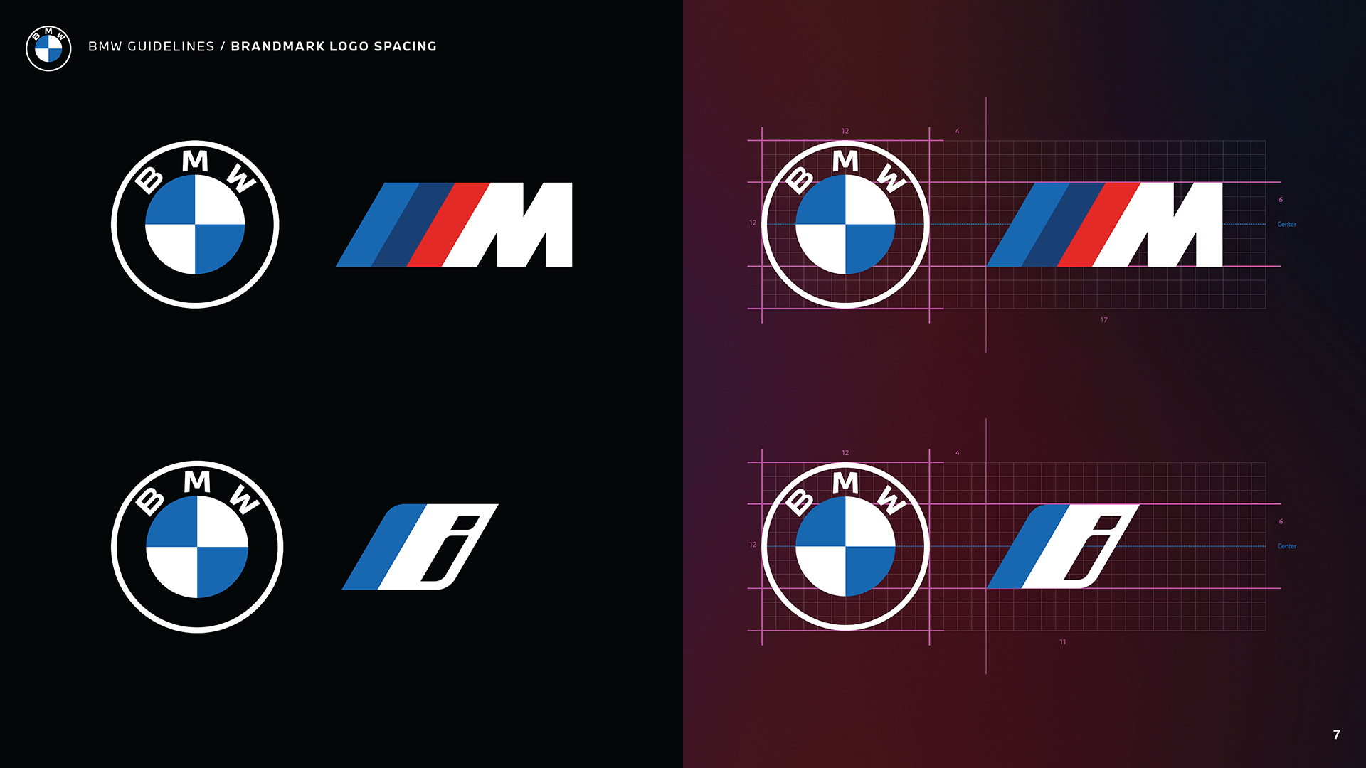
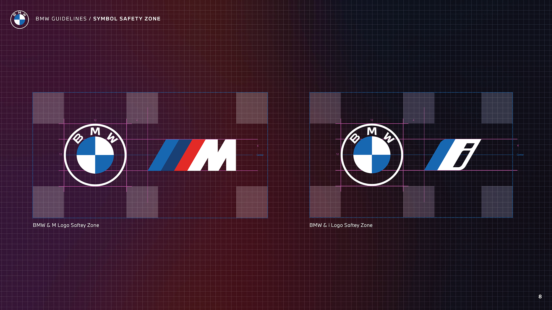
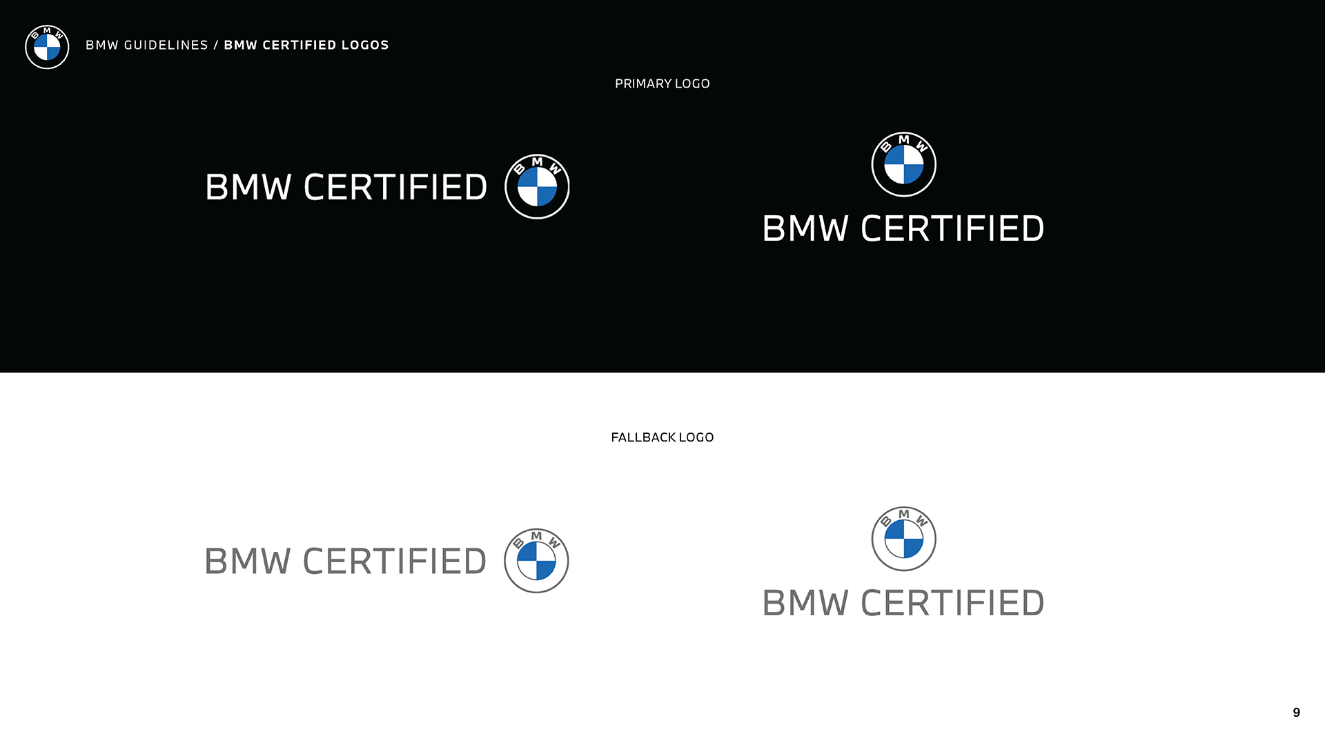
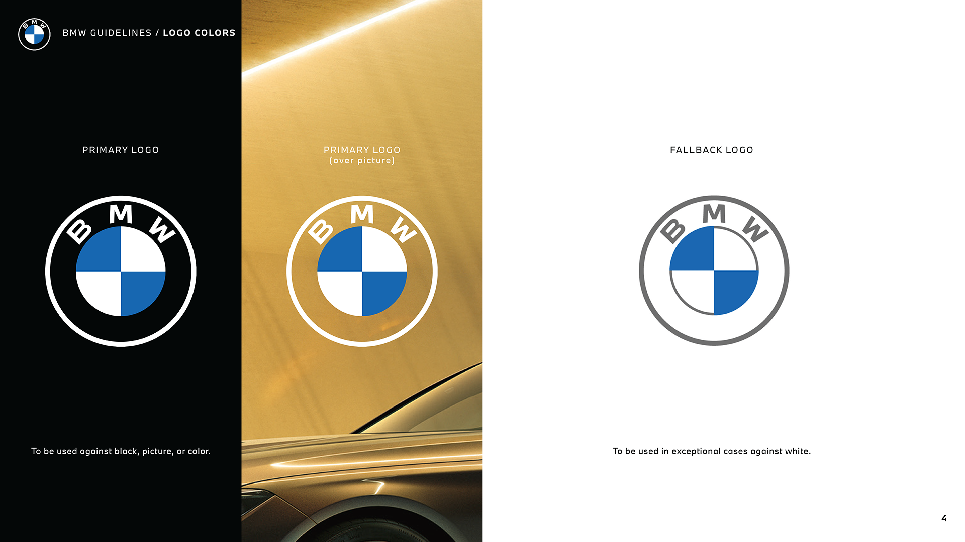
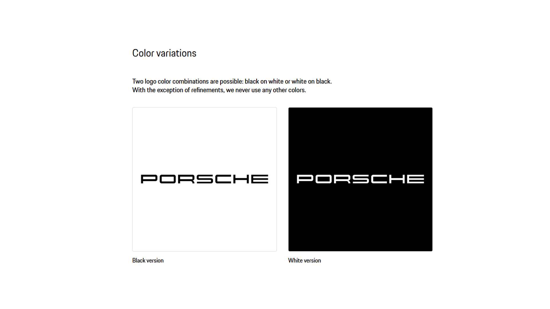
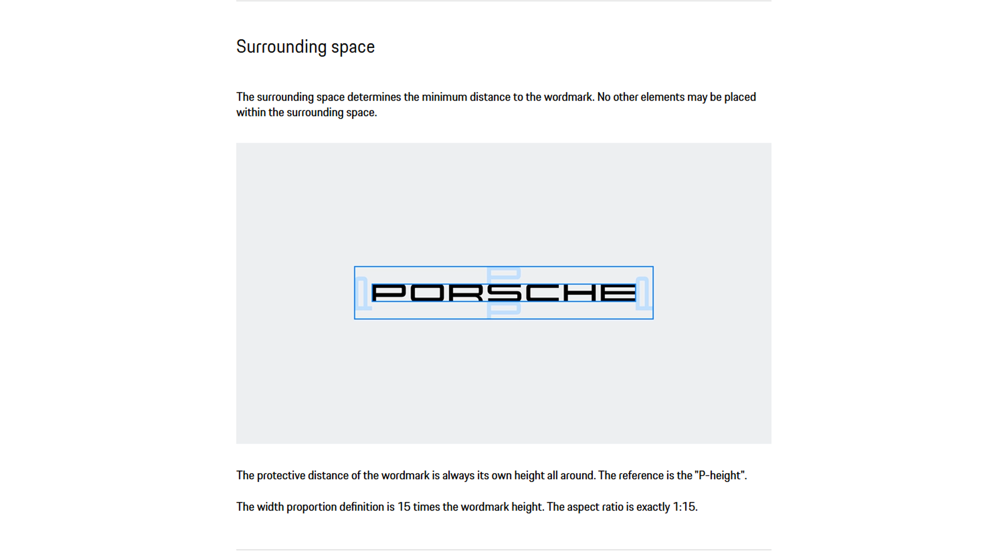
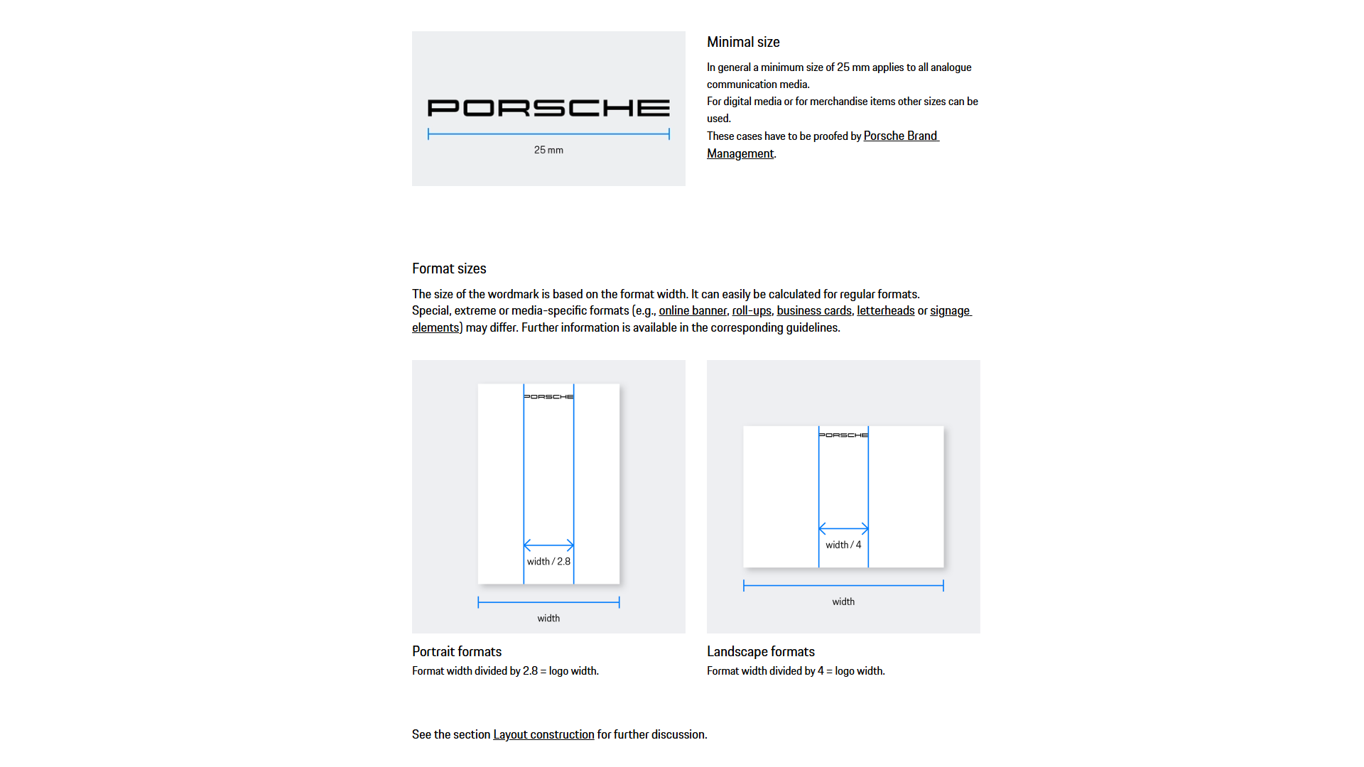
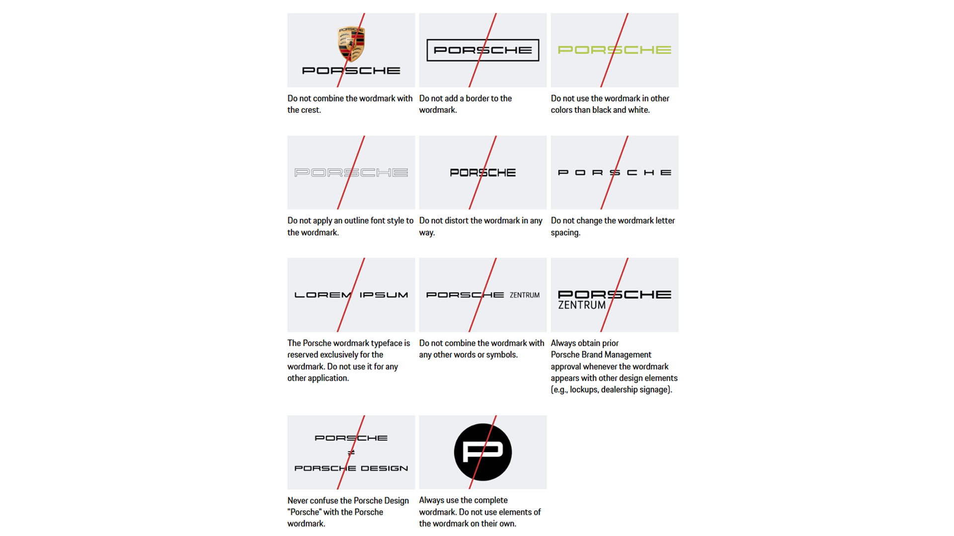
Porsche and BMW enforce strict logo controls, but their brand guidance philosophies diverge sharply. Porsche allows its complete color logo design only on white backgrounds and approved grey-line art designs to maintain its heraldic identity. BMW supports adaptations such as inversions and monochrome on a range of light/dark backdrops for digital/print versatility. Porsche demands double the logotype’s capital height around the full marque for composite wholeness, while BMW enforces proportional exclusion zones around the roundel alone. The company wants to keep its roundel design intact across all facial-height uses. Through its strict rules, Porsche creates emotional brand storytelling that connects all brand elements, while BMW’s enables operational versatility.
Typography System
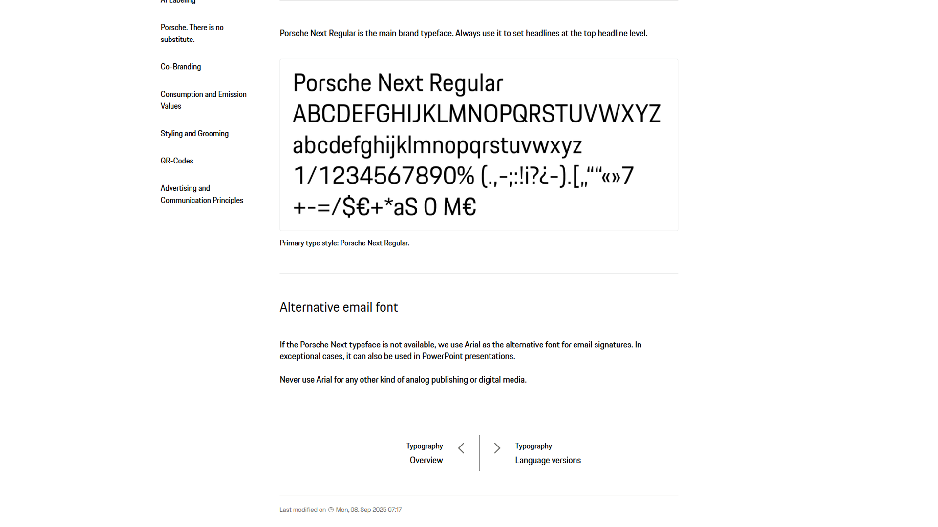
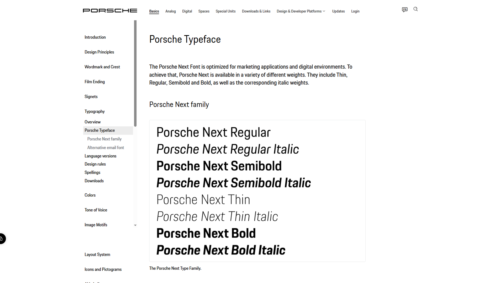
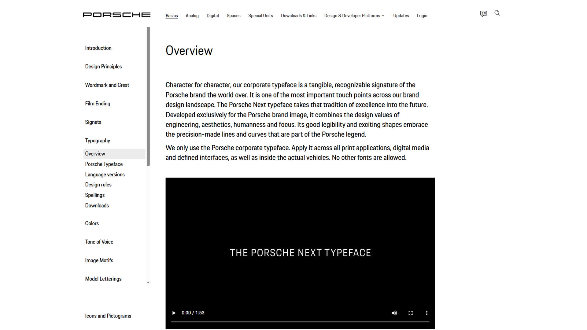
The Porsche brand uses typography as a fundamental element that defines its complete visual identity. The system maintains a uniform application across all branding materials, resulting in clear, elegant design elements that create a high-end brand image using their Porsche Next font. The design system contains shared elements that maintain design continuity while making typography work seamlessly with the complete brand experience.
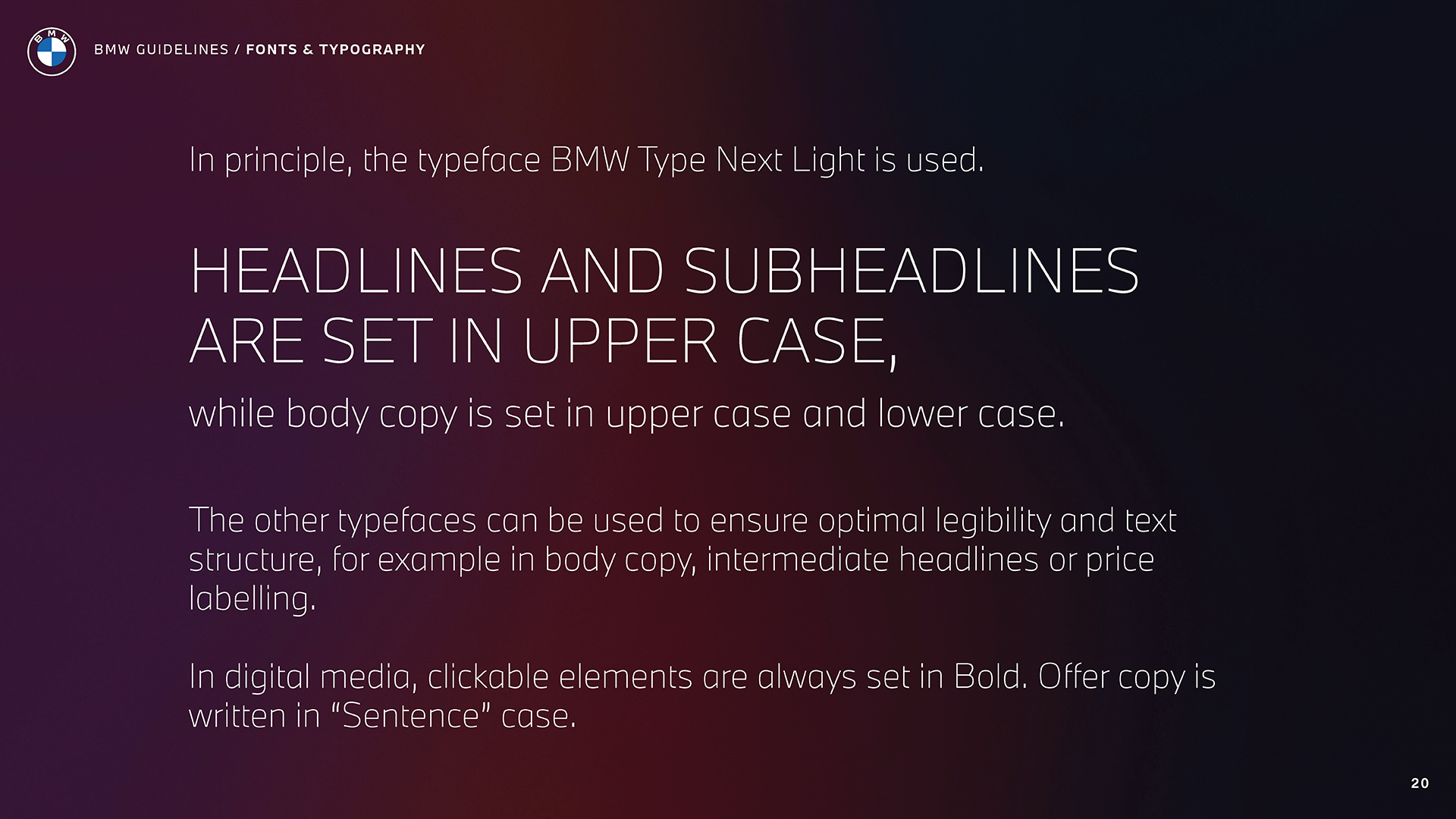
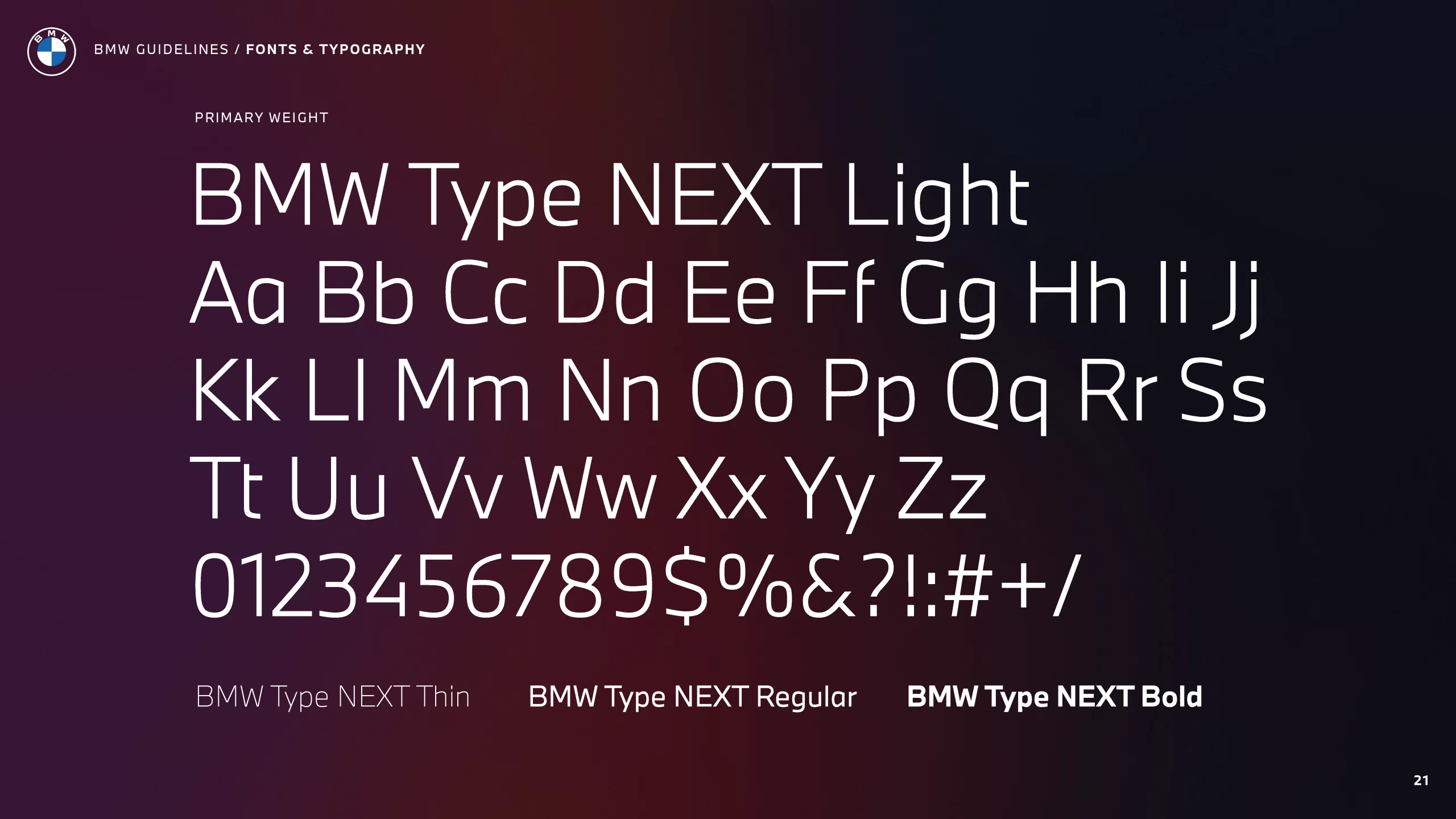
BMW, in contrast, approaches typography as a set of strict rules. BMW Type Next Light serves as the primary typeface, with headlines and subheadlines in uppercase, body copy in mixed case, clickable elements bolded, and offer copy in sentence case. The system defines all usage situations with exact specifications to ensure technical standards remain intact.
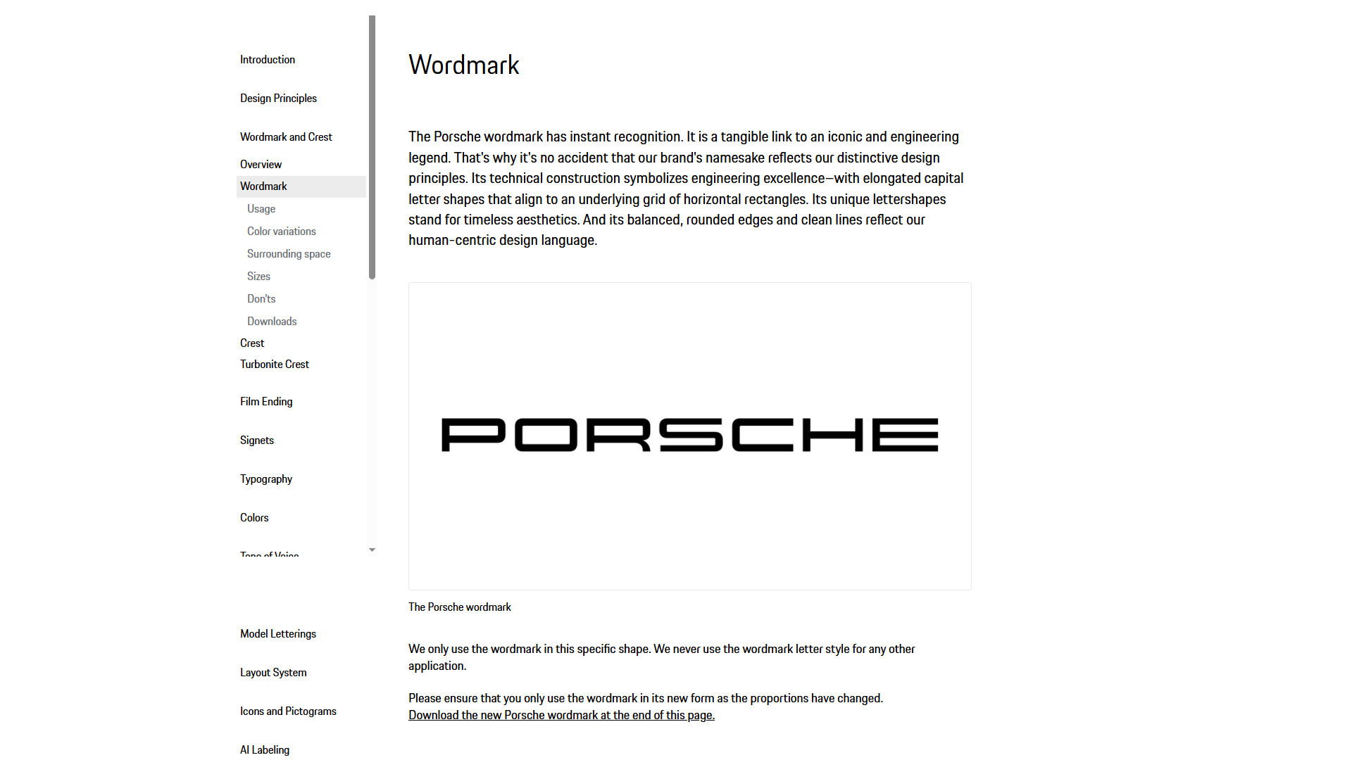
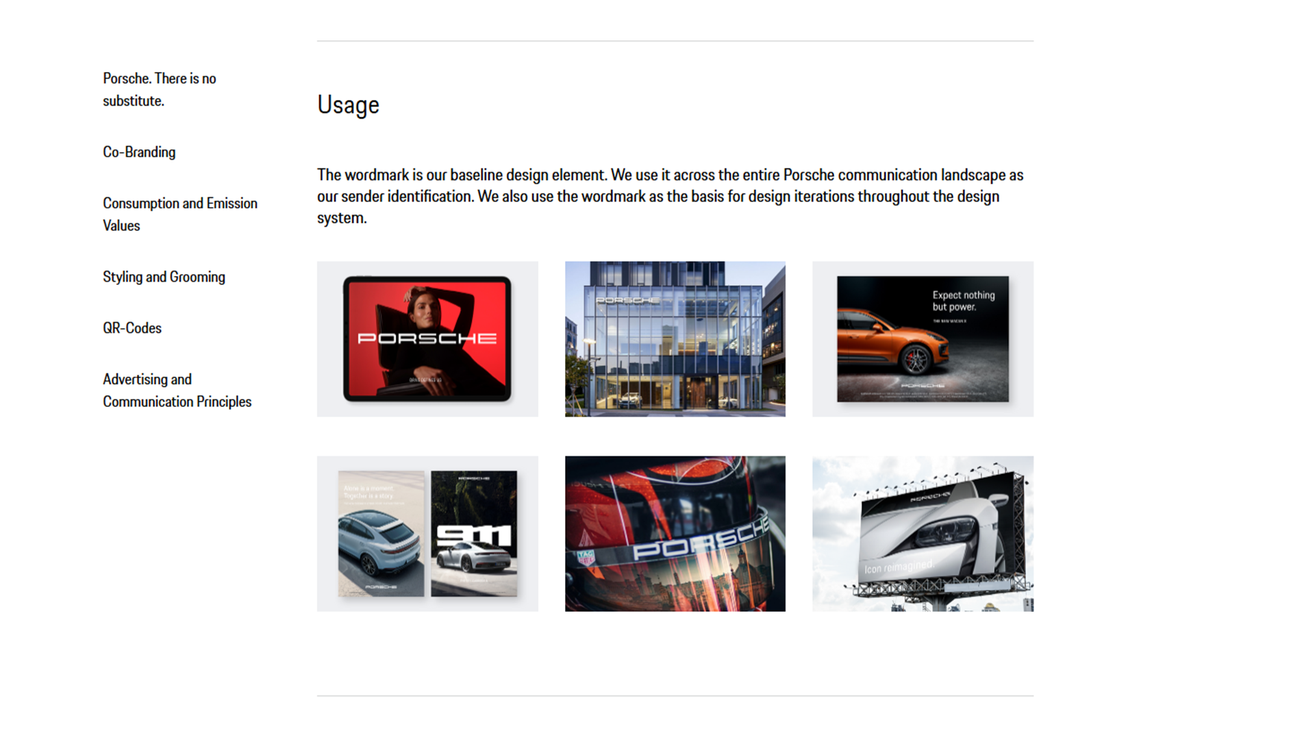
Porsche integrates typography into its indivisible marque (crest + the “Porsche” logotype) for unified brand storytelling and emotional identity. BMW uses explicit typography rules with its standalone roundel to enforce precise, modular design standards.
Color System
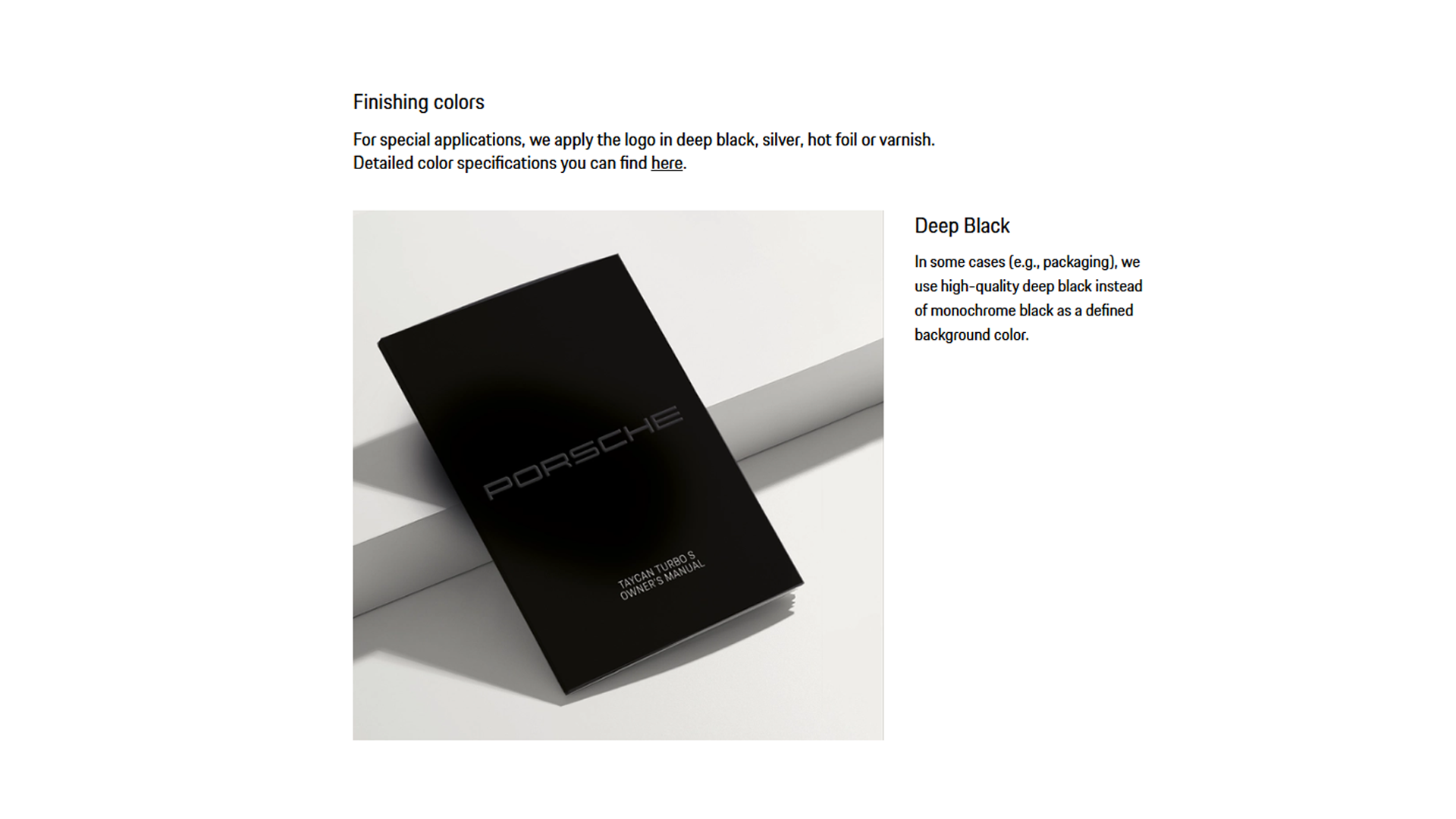
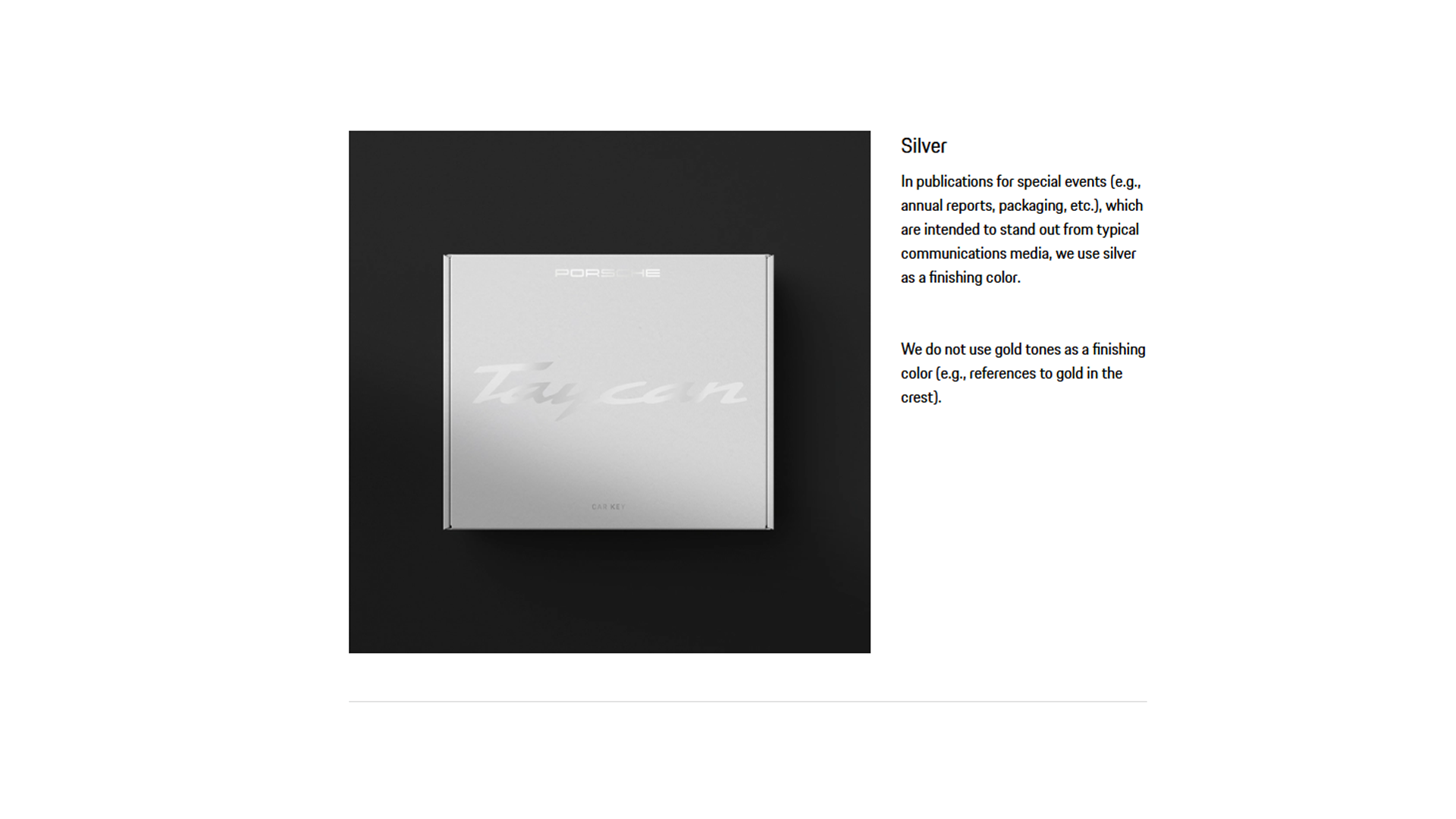
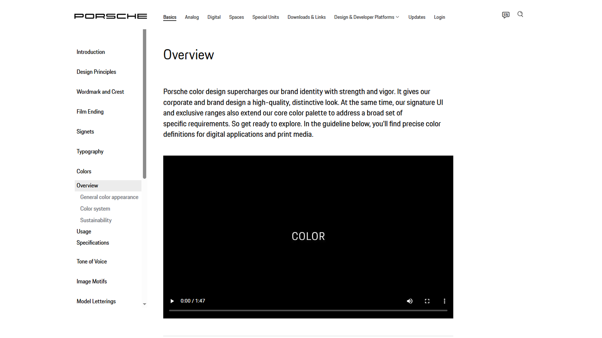
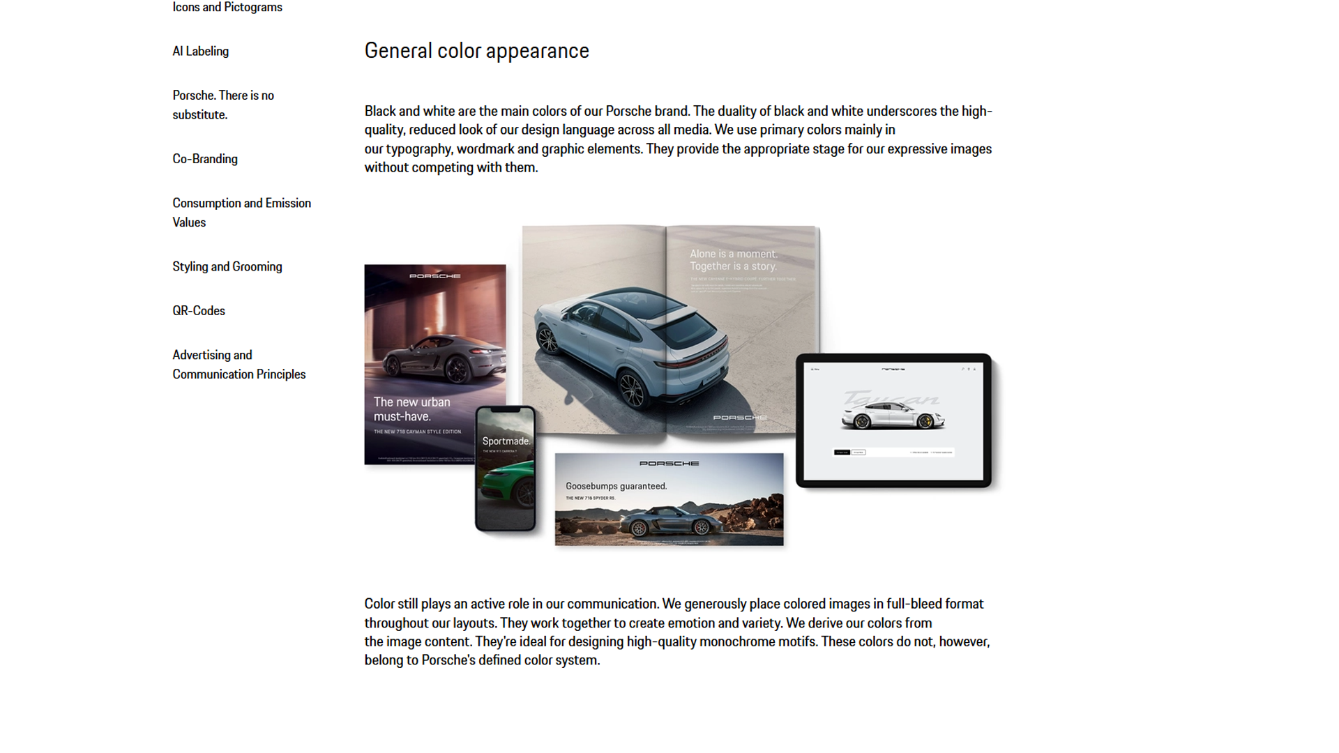
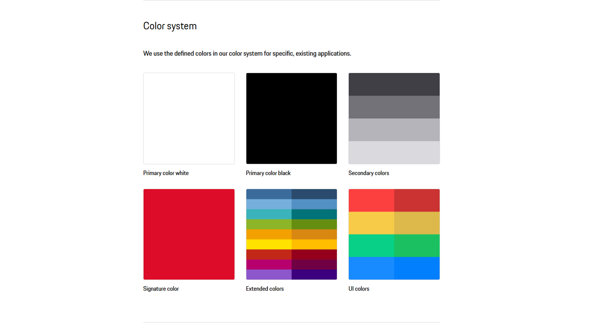
Porsche uses color as a component of its complete brand identity system which establishes premium quality and brand consistency throughout all customer interactions. The brand uses color to create its brand identity and develop its environmental spaces which function as experiential elements that define the brand instead of standard technical specifications.
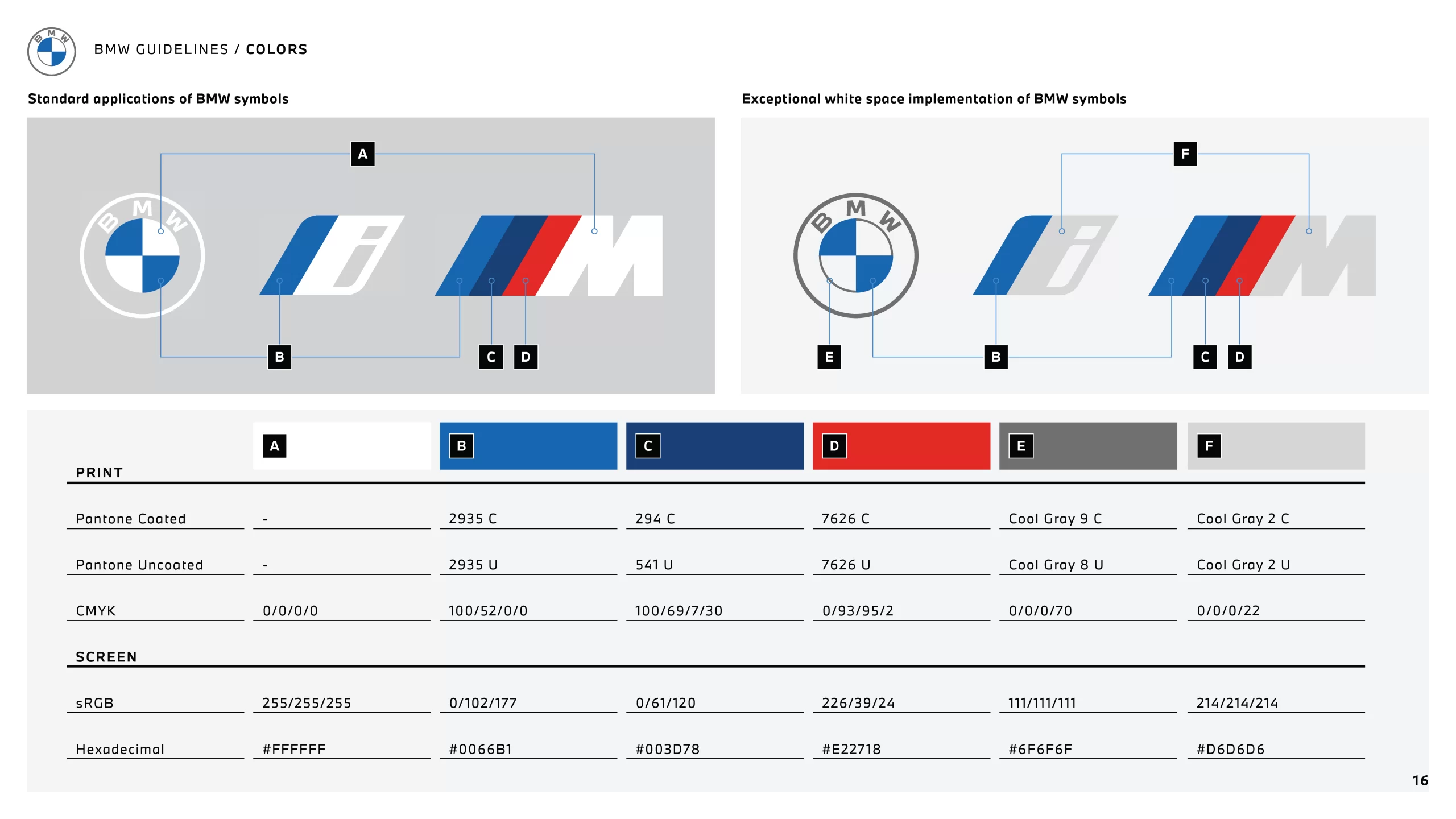
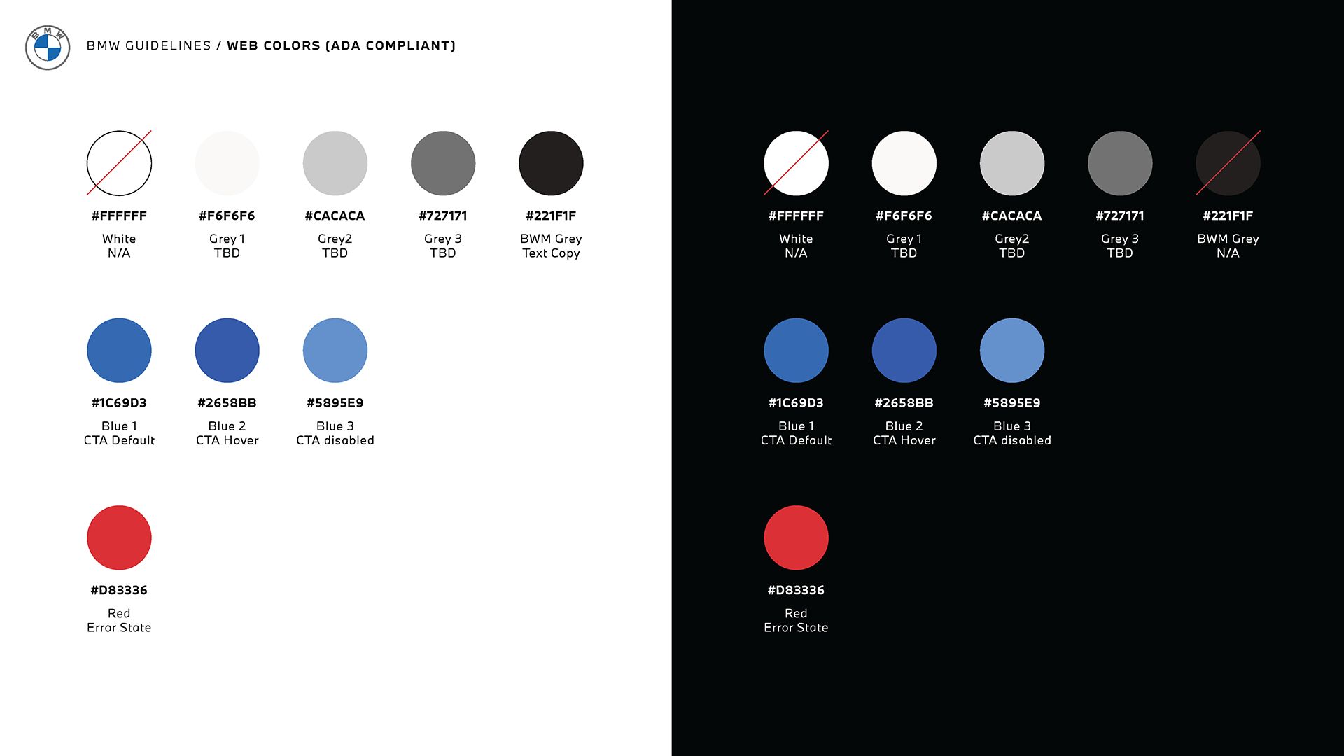
For BMW, color is described in precise numerical definitions. Color definitions are provided in Pantone, CMYK, RGB, and hex codes for print and digital use. Web color states are also described in detail, including CTAs, hover states, disabled states, and error states.
In other words, at Porsche, color is an aspect of experiential brand identity in the brand world, while at BMW, color is a technically defined palette according to precise standards.
UX Branding Rules
Porsche’s digital interfaces are designed to be clear, structured, and intuitive. The design uses short labels and CTAs, along with simple layouts, enabling users to experience every element as an important, high-quality product. A company’s brand identity determines the user experience according to its established definition.
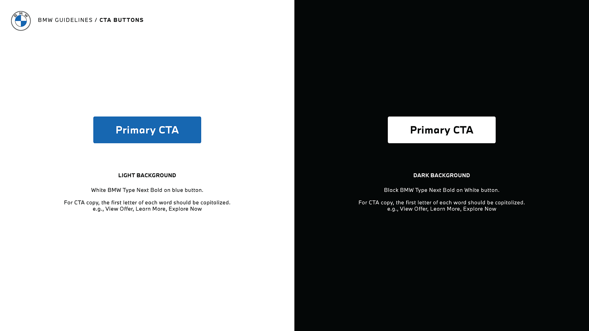
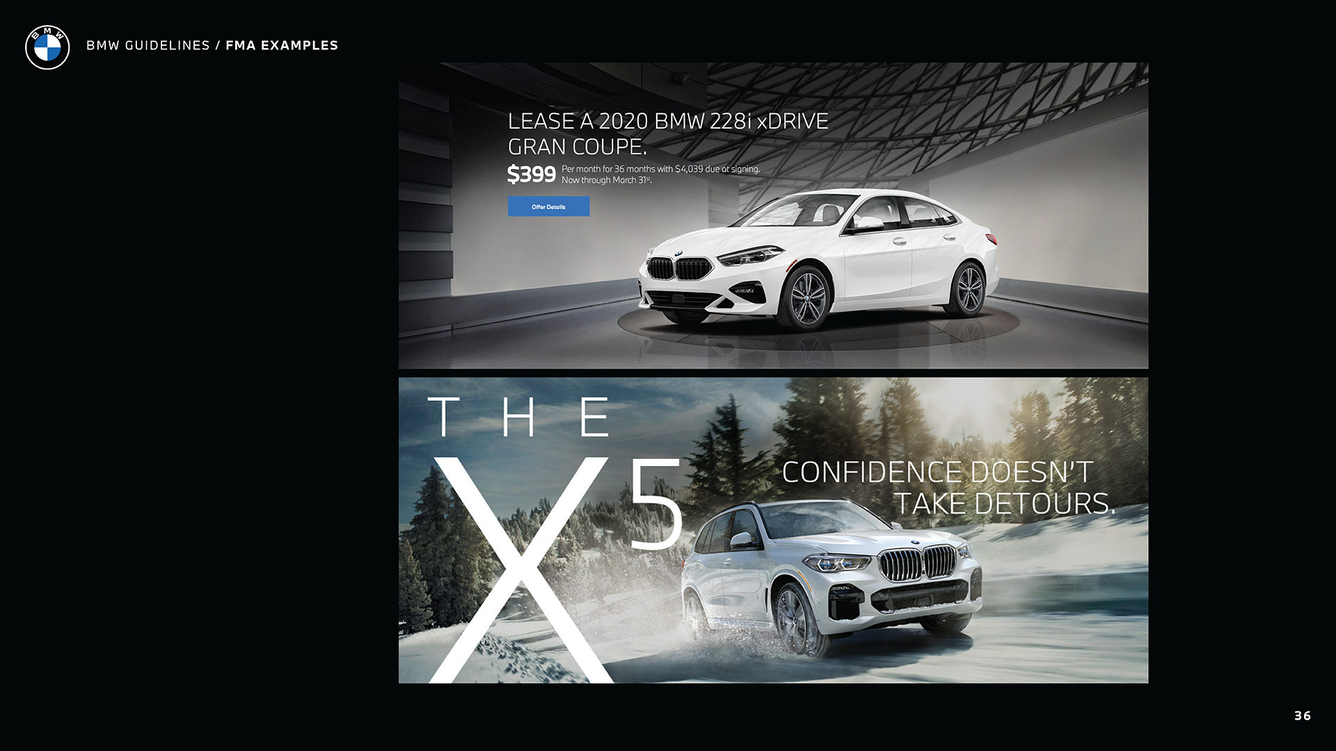
BMW’s digital interaction follows specific component requirements and essential compliance standards that define its entire framework. The design of CTA buttons specifies their particular colors and uppercase letter usage, while web content must achieve WCAG Level AA contrast requirements through established assessment procedures. UX is approached as the correct application of regulated components and accessibility rules.
Brand Consistency Principle
Porsche’s branding consistency is achieved through a branding strategy guided by archetypes, principles, and shared design systems. All touchpoints must feel unmistakably Porsche. Teams achieve coherent results by working together and using shared components that both teams require. They focus on shared philosophy.
BMW’s branding consistency is achieved through technical standards, including logo spacing, typography, color values, layout conventions, and accessibility compliance. These standards guarantee identical implementation across all platforms and international markets. They focus on specifications.
Conclusion
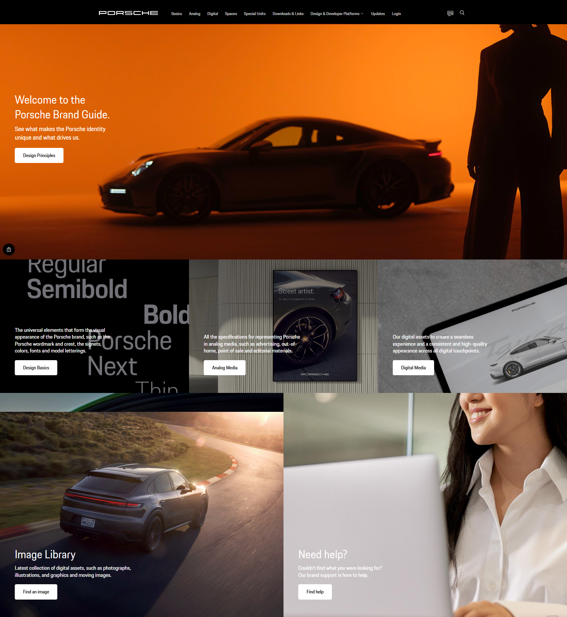
The Porsche brand portal and BMW guidelines represent two distinct methods that car manufacturers use to manage their brand identities. Porsche uses its branding system to create a complete brand experience, which develops through archetypal elements, core principles, and intentional design at every contact point. The brand experience itself conveys identity, emotion, and premium quality. BMW defines branding through its system, which requires organizations to use visual and linguistic elements aligned with a central claim across all communication channels. The system requires organizations to follow specific rules and standards, which they must execute precisely in order to achieve consistent results.
The two systems demonstrate different approaches to luxury car branding: Porsche’s experience-based design that follows philosophical principles and BMW’s standardized communication methods that use specific rules.
We wrote about how BMW uses its brand guidelines throughout its ads.
We also covered how Porsche’s brand developed between 1940 and 2000.